
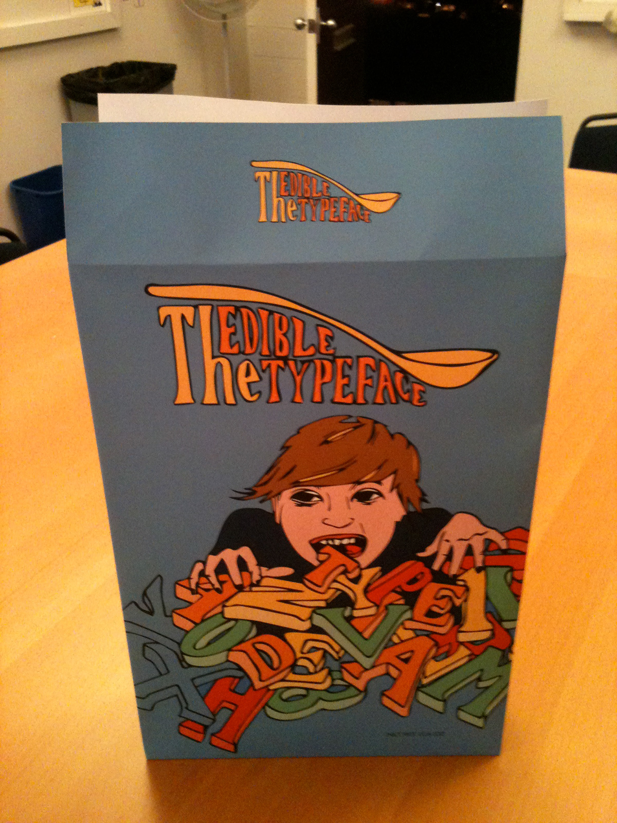

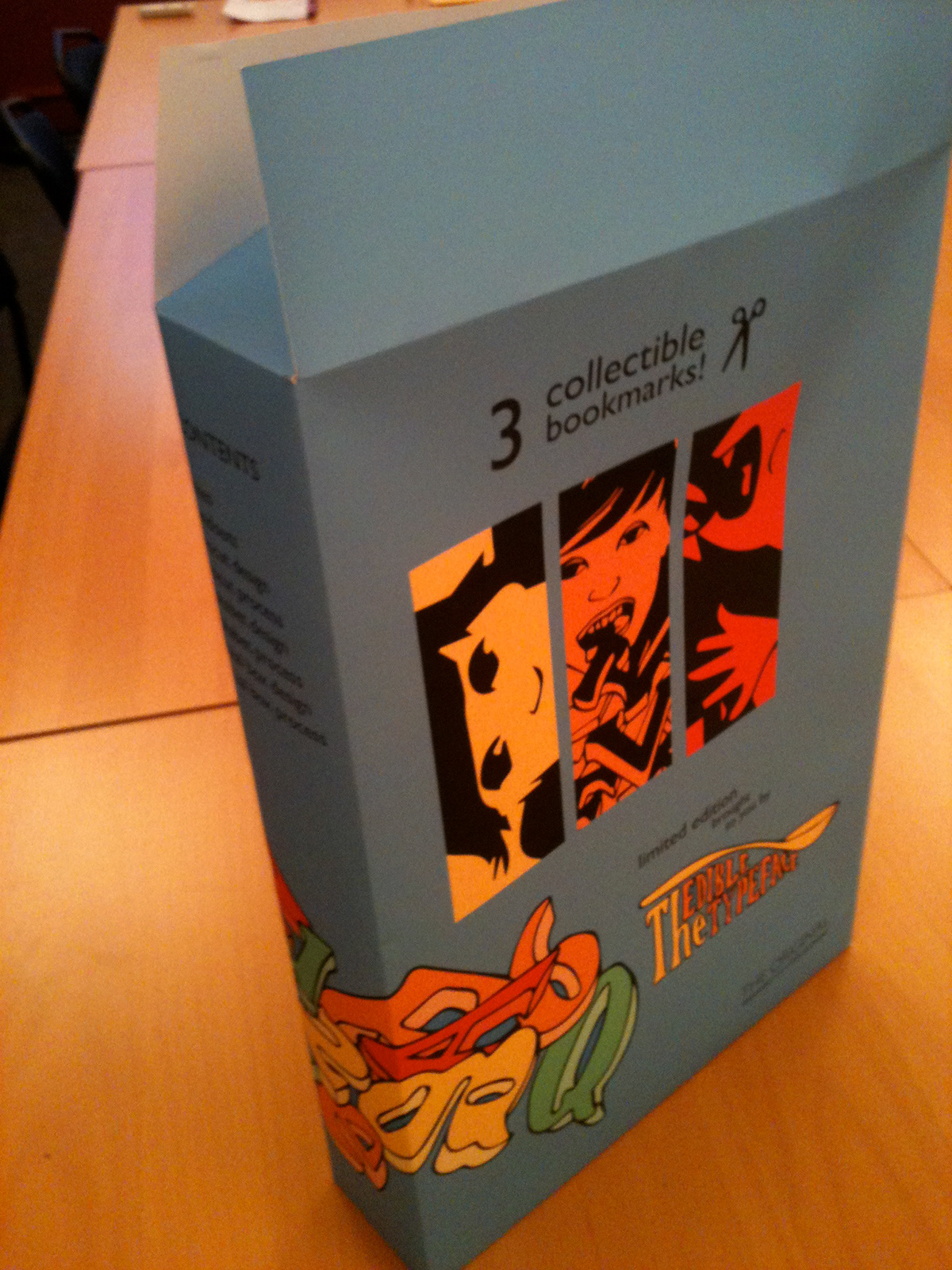

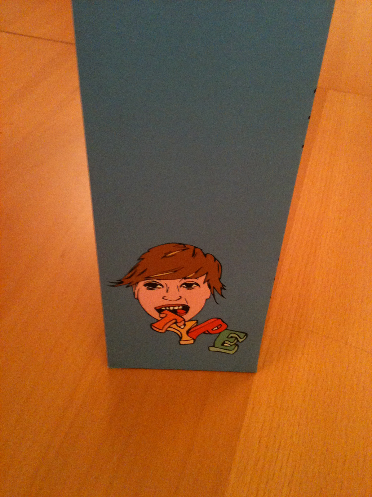
OBJECTIVE: To create a container (in the form of a cereal box) for my notes and projects from a Typography class I took at the School of Visual Concepts.
CONCEPT: This humorous design recalls playful images of cereals like Lucky Charms or Alphabits. The cover art also shows that is cereal box is a portfolio by spelling out the words "Type1" and "Deva" (my name) within the jumbled letters.
COMPONENTS: Logo Design for The Edible Typeface and package design for the cereal box.
IMAGERY: Hand drawn and colored in Illustrator.


